Do you want a fresh, new look in your home? Consider painting a room in your house. Paint can make a bold statement, invoke calmness, or just give your walls a fresh, clean look. One beautiful thing about painting is that it is easy to change! If you decide you want a different look, you can always paint over it! Let’s get inspired with these hot new trends from the Sherwin William’s Colormix 2024 Forecast! Shown in each color palette are some Agape Construction projects to help you get inspired!
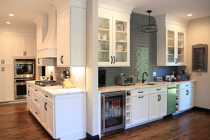
Palette No. 1 – Blues & Greens
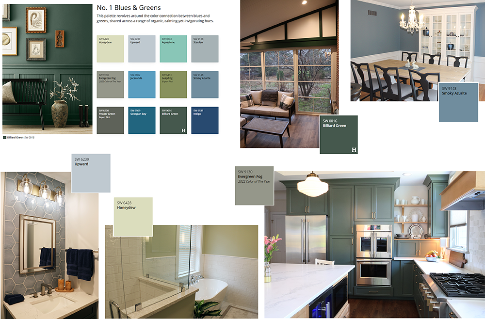 Organic colors such as blues and greens have continued to remain popular the last few years. Blues and greens used in our homes seek to further the connection between the interior and exterior. These colors hearken back to nature, promoting a sense of calm, peace, and ease. These colors are ideal in bathrooms, kitchens and more!
Palette No. 2 – Reds and Purples
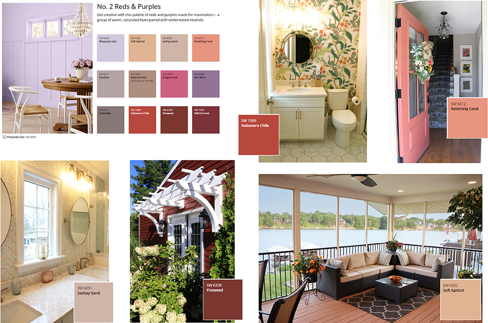 Bright colors and “maximalist” designs are growing in popularity and are great for accent areas in the home. Reds and purples can be used in their brightest form for a feature area, or in a more neutral tone in a larger area to convey warmth. Reds and purples can be a great addition to a space, but need to be added with care as they can become vibrant or over-saturated. Agape’s talented Interior Designers can help you find the perfect shade and amount of red or purple for your space!
Palette No. 3 – Deeps and Darks
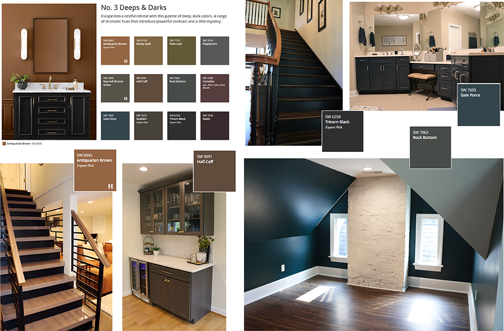 Another rising trend is moody or dramatic spaces. For those not wanting to get stuck with a color that may be deemed “trendy” in the next 5 years, these more neutral colors can still help you accomplish a bold look. The tones in this color palette can also more easily lend themselves to natural or stained wood, rather than exclusively paint. These deep and dark tones are great to use in larger areas to emphasize the expanse of space. It should be used sparingly in small areas to keep the area from feeling too closed in.
Palette No. 4 – Delicate Tints
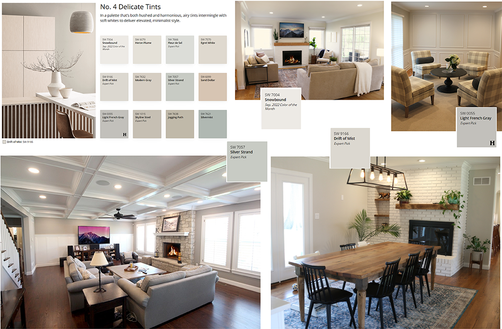 At first glance, these colors may all appear to be white, gray, or beige. With a closer look, you will notice undertones of many different colors. Whites, grays, and beiges are great for keeping spaces feeling light and airy, but being mindful of each shade’s underlying color could be a great way to subtly add color to any space. The delicate tints in this collection could be used throughout an area for a cohesive look, or they can be utilized to balance out darker features in a space.
Are you feeling inspired? If you would like assistance finding the perfect palette for your room, Agape’s Interior Design team is here for you!